


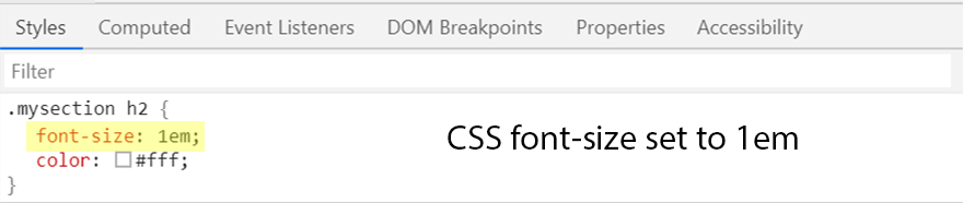
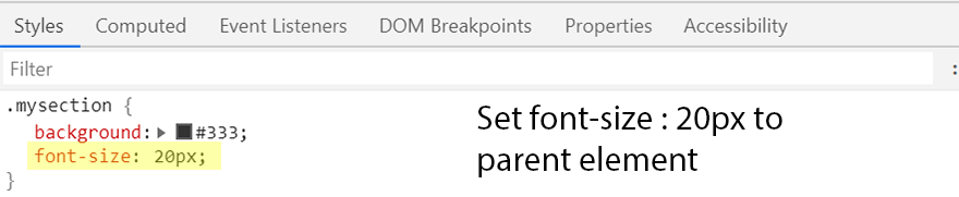
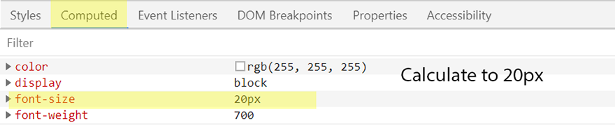
1. em :-
em is relative to font-size of the current parent element of html.
For example, If We set font-size:20px to div mysection, then any child div set to 1em is equal to 20px, 0.5em=10px, 2em=40px.
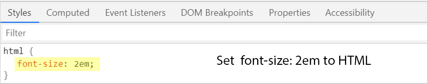
When an em based font-size is set on the html element, the pixel value it convert to will be a multiple of the browser font-size setting.
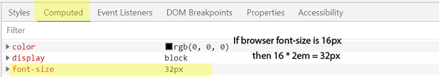
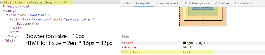
For example, if the html element had a font-size property set to 2em, the root font size would be 2 times the browser font size setting.
If the browser font-size was set to 16px, then root font-size would come out as 20px, i.e. 2 * 16 = 32.
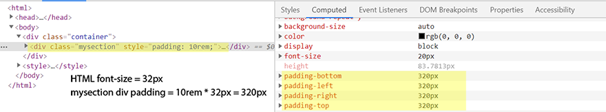
If HTML font-size in em and inner element div font-size in rem then it calculated in px like below:
If browser font-size is 16px , then HTML font-size is 32px.
If inner element div padding is 10rem then 32 * 10rem = 320px
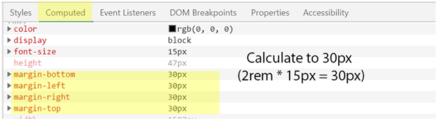
See below screenshots,
2. rem :-
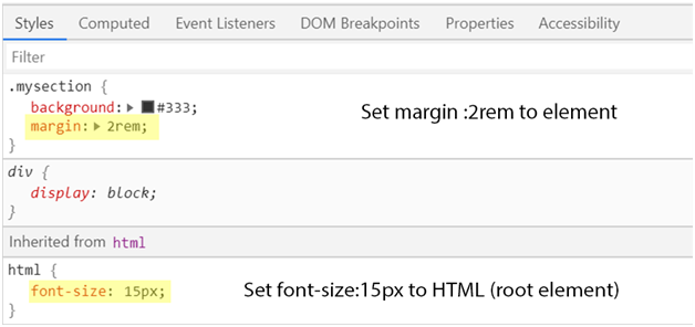
rem is the root em. It is relative to the default font-size of root element or HTML tag.
rem units are similar to em units but the difference is em unit is always references to current parent element of html and rem unit is always references to the root element or html tag.
For example,
if the font-size of the html tag is 16px (that is the default size for an html document), then 1rem unit is equal to 16px. That makes .5rem=8px, 2rem=32px, etc.
Hope you find it useful !
Thanks!! 🙂